How Kagi Charts Work: What They Are and How to Use Them


Abstract
What if you could see the true direction of the market without getting lost in the chaos of daily price changes? While other chart patterns focus on recording market change based on time, Kagi charts hold the storyline of market happening in different way. Powerful yet often overlooked, these charts act as a valuable tool in the world of trading, simplifying market analysis by focusing on significant price movements.
Before you dive in all the ‘How’ and ‘What’, let’s explore the fundamentals of Kagi Charts, including what it is, how it works, and what is its significance in the finance world. So without further delay, let’s jump in.
What Is a Kagi Chart?

A Kagi chart is a unique type of chart used to track the price movements of a security. Unlike traditional charts like line, bar, or candlestick charts that show both time and price, a Kagi chart focuses only on price.
Originating in Japan over a hundred years ago, Kagi charts offer a different way to look at price trends, cutting through the noise to show patterns that can guide traders in making better decisions.
In a Kagi chart, the price is plotted on the y-axis, but time isn’t considered at all. By removing time from the equation, a Kagi chart provides a clearer view of how a security’s price is moving, filtering out the “noise” that often appears in other types of charts like candlesticks or bar charts.
Origin & History of Kagi Charts

The Kagi chart was first developed in Japan during the 1870s, around the time when stock markets were emerging in the region.
Originally, these charts were used to track the price of rice, helping traders understand supply and demand levels. Interestingly, candlestick charts, also widely used today, were also created by Japanese rice traders.
The continued use of these charts today, available on most charting platforms, highlights their effectiveness in market analysis.
Kagi charts, along with other time-independent chart types like Point and Figure and Renko charts, were introduced to the Western world by Steve Nison. Nison, who spent a significant amount of time in Japan studying these unique chart types, also published several books on the various charting techniques still in use today.
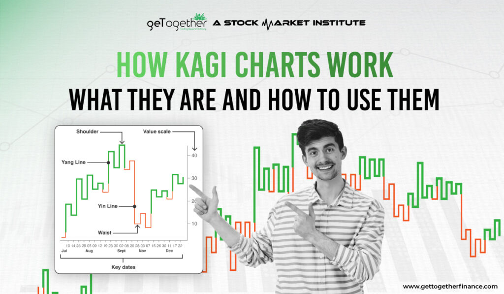
On a Kagi chart, a buy signal happens when the vertical line changes from thin to thick. This thick line stays until the price drops low enough to change it back to thin. The line turns thick when the price reaches a new high (if it was thin before). It stays thick as long as the price doesn’t drop to a new low. If the price falls to a new low, the line turns thin and stays that way until the price rises to a new high again.
Traders should be careful and not just buy or sell every time the line switches between thick and thin, as that could lead to losses.
Kagi charts move up and down based on how much the price changes, known as the reversal amount. These charts don’t depend on time as small price changes that can confuse traders. Since the line only changes direction after a certain price level is reached, these charts can guve a clearer view of trend probably more early than other chart types.
Based on the charting platform you use, the Kagi lines might be colored instead of just thin or thick. For example, a red line might show the price has dropped below a recent low, while a green line shows it has gone above a recent high.
Key Features of Kagi Charts

These charts consist of vertical lines, called “Kagi lines,” that change based on market conditions. The thickness and direction of these lines depend on specific price levels, known as “reversal amounts” or “box sizes.” This means Kagi charts highlight significant price movements while ignoring small fluctuations that can make it hard to see the overall trend.
Here are few primary features of Kagi charts:
Price Focused
Kagi charts don’t worry about the time. They focus only on how much the price changes – in simpler terms how much price goes up or down. This helps traders see the overall trend without getting distracted by small price changes.
Line Thickness
The chart uses vertical lines that change thickness:
- Thin Line: Shows that the price is going up (bullish trend).
- Thick Line: Shows that the price is going down (bearish trend).
Reversal Threshold
The direction of the line changes only when the price moves by a pre-set amount in the opposite direction. For example, if the price moves enough in the opposite direction, the line will change thickness and direction.
No Regular Time
The lines can be short or long depending on how quickly the price changes. This makes Kagi charts different from regular charts that use equal time intervals.
What makes a Kagi chart stand out is its continuous “snake-like” line. The line changes color based on price movements—red when the price is falling and green when the price is rising, especially when previous highs or lows are broken.
Traders prefer using Kagi charts because they effectively remove market noise and clearly show trends. These charts are commonly used in technical analysis and are popular among day traders.
Kagi Chart Trade Signals

Kagi charts gives clear signals for trading by focusing on important price changes instead of time. Here’s how they work:
Buy and Sell Signals
- A buy signal appears when the Kagi line changes from thin (red) to thick (green). This means the price has gone above the previous high, suggesting more demand for the asset.
- A sell signal happens when the line changes from thick to thin, hinting the price has dropped below the previous low, which shows increased supply.
Trend Reversals
Kagi charts can help spot when trends are changing. But if the line switches direction, it speaks of a change in market sentiment. For example, when the line goes from thick to thin, it could mean the market is turning bearish (going down).
Support and Resistance Levels
Kagi charts highlight important price levels where the trend may change. These levels can act as support (where prices stop falling) or resistance (where prices stop rising). You can use these levels to enter and exit the trades you want.
Swing Highs and Lows
On a Kagi chart, swing highs are called ‘shoulders’, and swing lows are called ‘waists’. Rising shoulders suggest that the market is going up, which can be a good buying opportunity. Falling waists indicate that the market is going down.
Three Buddha Bottom
The Three Buddha Bottom is a well-known pattern appears on Kagi charts similar to an inverse head and shoulders. This pattern can signal a potential buying opportunity.
Reducing Market Noise
It is crucial to understand that a kagi chart only change when the price moves by a specific amount, which helps filter out small price changes. This makes it easier for traders to see the overall trend without getting distracted.
Combining with Other Indicators:
Like any other indicators or analysis style in stock marker, there is no standalone pattern that is provenly announce market directions. Hencw to improve trading decisions, Kagi charts can be used with other tools like moving averages. This combination helps confirm signals and reduces the chances of making mistakes.
Conclusion
In a nutshell Kagi charts are useful for spotting buy and sell signals, identifying trend reversals, and highlighting important price levels while reducing distractions from minor price changes. By using Kagi charts along with other analysis methods, traders can make better trading decisions. However, eventually it depends on your trading setup and risk management how well you can perform in the market. Remember, stock market is not a sprint, it’s a marathon, hence staying consistent, patient, and observant is the only key to stay ahead of regular traders.
FAQs
What is the reversal amount in a Kagi chart?
The reversal amount is a predefined price change that must occur for the Kagi chart to change direction, helping filter out minor fluctuations.
What is the best reversal amount to set for Kagi charts in the Indian market?
The ideal reversal amount can vary, but many traders in India start with a percentage between 2% to 5%, depending on the stock’s volatility.
What are shoulders and waists in Kagi charts?
Shoulders are horizontal lines that form when the Kagi line changes direction without a thickness change, while waists are horizontal lines that connect downward movements to upward ones.
What are the limitations of Kagi charts?
Kagi charts may lack detailed information compared to candlestick charts and can be less intuitive for some traders.


 Facebook
  Instagram
  Youtube
