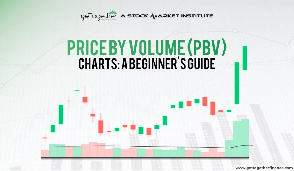
Price by Volume (PBV) Charts: A Beginner’s Guide
- February 26, 2025
- 2163 Views
- by Arun Singh Tanwar

 Facebook
  Instagram
  Youtube
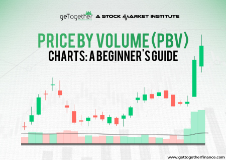
Most retail investors look at price movements based on volume in charts. Seeing the craze for this technique, the modern market has introduced some fascinating charts that not only track volume with price but also help you spot pending orders easily.
Price by Volume (PBV) charts are contemporary yet cool charting tools that show how much trading happens at different price levels. Basically, PBV charts help you see where the most action is. In this blog, we will study what price-by-volume charts are, how they are interpreted, and what their significance is among traders. We will also go through some of its major setbacks with suitable examples for better understanding. So let’s begin with the basics.
What is A Price By Volume Chart?

A Price by Volume (PBV) chart is a simple tool that shows how much trading happened at different price levels. What it does is depict the relationship between price levels and volume for the purposes of dealing in the market which is usually an intuitive relationship.
This means that, instead of merely showing how much was traded over time like normal volume charts, this methodology highlights the price levels where the most buying and selling took place.
Here’s what it looks like:
- The prices are shown on the side (up and down).
- Volume bars stick out next to each price, showing how many people traded at that price.
For example, if a lot of trading happened when a stock was priced between ₹100 and ₹110, you’ll see big bars next to that price range. This tells traders that people are really interested in that price area, and it might be a good place to watch for potential market moves.
Traders use PBV charts to figure out key price levels, like where prices might go up (support) or where they could face resistance (slow down). It helps them understand where the market is most active and make better decisions. While volume has always been a critical part of market analysis, traders initially only focused on how much was traded over time (daily or weekly volumes). But as technology improved, tools like PBV charts were developed to offer more detailed insights, showing not just when but where trades happened.
How PBV Works (GRAPH)
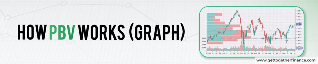
The crucial point is having an understanding of how it works. Like any other visual chart, the chart includes significant aspects of volume changes over price, helping traders track the high or low volume points.
As shown in the picture, PBV is also like a regular price chart, but with extra bars sticking out next to each price point. These bars show the trading volume (how many shares were bought or sold) at that specific price.
- Prices go up and down along the side.
- Volume bars stretch out next to the price, showing how active the trading was at that level.
In detail;
If a stock’s price is moving through areas with small PBV bars, it usually travels easily because there’s not much resistance. But if the price hits an area with large PBV bars, it may struggle to move above or below that level since lots of people traded there, marking it as a key area of interest.
Some PBV charts even color-code the bars (green for buying, red for selling) to make it easier to spot whether there was more buying or selling at those price levels. This helps traders understand whether a price point is likely to act as heavy support or strong resistance.
How to Interpret Price By Volume Charts

At first, decoding PBV charts might seem complex, but it’s pretty straightforward once you get the hang of it.
Here, let’s take a quick look at a simple guide to help you understand what to see:
Read The Layout
A PBV chart shows price levels on the horizontal axis and volume on the vertical axis. A PBV chart shows price levels on the bottom and volume (how much was traded) on the side. Each bar tells you how much trading happened at a certain price.
Identify Key Price Levels
Here is how you decode key price levels:
High Volume Bars: When you see a tall bar, it means a lot of trading happened at that price and there is the bulk of pending orders, waiting to be triggered.
For example, if a stock has a high volume bar at ₹100, it suggests that many traders found that price interesting. This can act as a support or resistance level.
Low Volume Bars: If the bars are short, it means not many trades happened at those prices. Prices with low volume often move quickly because there’s less interest.
Spot Support and Resistance
These levels often act as support (where prices stop dropping) or resistance (where prices stop rising), making it easier to predict price movements:
- Support Level: This is a price where the stock tends to stop falling. For example, if the price reaches ₹100 and bounces back because of the high volume there, it indicates strong support.
- Resistance Level: This is a price where the stock struggles to go higher. For example, if a stock tries to go above ₹150 but keeps dropping back down because of high volume, that price acts as resistance.
Watch for Breakouts and Breakdowns
- Breakout: If the price climbs above a resistance level with a high volume bar, it might show that the stock is gaining momentum.
- Breakdown: If the price falls below a support level with strong volume, it might suggest the stock could keep dropping.
Using Volume Colors
Some PBV charts use colors to show buying and selling volume. For example:
- Green Bars: Indicate buying volume, meaning traders are buying the stock.
- Red Bars: Show selling volume, hinting traders are offloading their shares.
These are the important factors to interpret while reading price by volume charts.
Keep the Time Factor in Mind
PBV charts show the total volume traded at certain price levels over a period of time. This means that the support and resistance levels they highlight might not always stay relevant in the future.
For example, suppose a stock has released its quarterly report which wasn’t good. The company saw a huge sell-off, one price level might show a lot of volume. But it doesn’t necessarily mean it will act as a strong support level every time. As a trader you must know that market conditions change, thus it is necessary to look at future possibilities despite aiming too much on past data.
Significance of Price By Volume Chart

A Price by Volume (PBV) chart is super helpful for traders. Here’s why PBV charts are important:
Finding Key Price Levels
PBV charts show the price areas where most trading took place. If a stock traded a lot at ₹500, that price might act as a support level. This makes it easy to spot important points where the price might pause or change direction.
Seeing What the Market Thinks
These charts help you understand which prices people are most interested in. If a lot of trading happened at ₹520, it means many traders assume that price is important. It gives a good idea of how the market is reacting.
Predicting Price Movement
Prices often move quickly through areas with less trading (small PBV bars) but slow down at levels with a lot of trading (big PBV bars). This helps you figure out where the price might move easily and where it could struggle.
Making Better Trade Decisions
Knowing where heavy trading happened can guide you on where to buy or sell. For example, you might buy when the price hits a strong support level or sell when it nears resistance, based on the PBV chart.
Works As Smart Risk Management
PBV charts help you place stop-loss orders smartly. For instance, if you can figure out good support and resistance points, you can put your stop-losses in safer spots, reducing your risk.
Limitations of Price By Volume Chart
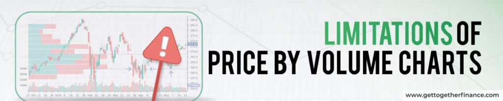
While Price by Volume (PBV) charts are great tools for traders, they do have some limitations that are worth keeping in mind:
Outdated Support and Resistance Levels
PBV charts definitely tell traders good price levels are important for a duration of time, but markets are always changing. The price levels that were important in the past may not hold the same importance in the future.
For example, if a stock goes through major news, like a bad earnings report, old support and resistance levels might lose their relevance.
Not Predicting Future Price Moves
It is pretty much evident that PBV charts can tell where most trading happened in the past, but they don’t tell you where the price will go next. While they show good areas of interest, they don’t guarantee that those levels will act as support or resistance again.
Volume Alone Isn’t Enough
Even though PBV charts show how much trading happened at certain price levels, they don’t explain “why” the trading happened. A large volume at a particular price could mean many different things, and by itself, volume isn’t always a clear indicator of future market direction.
Can Miss the Bigger Picture
Focusing too much on PBV levels can cause traders to overlook other important market factors like trends, news events, or economic data. It can be just one part of a larger trading strategy, and relying on it too much or alone might lead to missed opportunities.
Need Other Tools for Confirmation
PBV charts work best when combined with other tools like demand-supply dynamics, trendlines, indicators, or candlestick patterns. Relying solely on the volume bars without cross-checking with other data can sometimes lead to false signals.
Limited on Short Timeframes
PBV charts can be less reliable for short-term trading, especially if there hasn’t been enough trading volume to create clear support or resistance levels. On lower timeframes, you may see fewer meaningful patterns in the PBV bars.
In Brief
In summary, Price-by-volume (PBV) charts are one of the valuable technical tools for spotting important price levels based on past trading activity. It is really helpful for traders who want to know where support and resistance might form. Overall, it makes it easier for traders to plan trades and manage risk.
However, it’s super important to remember that PBV charts show what ‘has’ happened, not what ‘will’ happen. For the best results, use PBV charts along with other tools and strategies, especially Demand-Supply Dynamics. But it is important to always keep an eye on changing market conditions.
FAQs
Is it essential to monitor PBV charts continuously?
While you don’t need to watch them constantly, it is important to keep regular checks as it can help you stay updated on key price levels and market trends.
Do institutional traders use PBV charts?
Yes, many institutional traders use PBV and volume analysis to inform their trading strategies.
Are there books on trading that discuss PBV charts?
Yes, many trading books cover volume analysis and include discussions on PBV charts. You can also learn it from many YouTube Channels or online courses.
Is it better to trade with high or low volume?
High volume typically shows more liquidity and stability, making it safer for trading.
How does market news affect PBV charts?
Major news events can change trading volumes and alter the importance of price levels on the chart. It changes the volume of active traders, raising or lowering the market volatility.